I just posted a new version of SnpMap that adds a few little features. Here is the link:
SnpMap v.1.0.2
Now would be a good time to give an introduction into SnpMap. The purpose of SnpMap is to help you explore your autosomal genome data from 23andMe or FamilyTreeDNA. In particular, it's meant to help identify segments of your chromosomes that show ancestry, either recent or ancient, that show similarities with different regions of the world, and the populations within those regions. One thing you'll discover, is that genetically, people all over the globe are quite similar. At some positions on the chromosome, people can have alternate alleles for that position. Some of these are the SNP locations that the DNA services test. Although any allele can occur in people from any part of the globe, studies have shown that the frequencies of the alleles are often different among people from different parts of the world. For most SNPs the frequency differences are small - too small to be very useful for identifying the region or population from which a person might have ancestry. But there are some SNPs that have sizable frequency differences. These difference usually vary over distance, so that the difference is small between adjacent populations, or even adjacent regions, but significant between distant regions. Finding these SNPs and displaying information about them is what SnpMap helps you do.
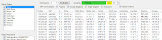
After you load your genome data using the File menu in the upper left corner, select a chromosome, choose your options, and click on the Recalculate button. You'll then see something like the picture above. If you checked more than one region, SnpMap will compare those regions. If you checked only one region, SnpMap will compare the checked populations within that region. The grid will display the SNPs of interest, according to your option selections. You'll see the SNP physical base pair location, SNP identifier (like rs####), your alleles for that SNP, and region or population frequency information for your alleles. This frequency info will be in the form ##.#/##.## followed by possible markers. The numbers are the frequency each of your alleles occur within a region or population. For example, in the first row, I am homozygous TT. Among people in sub-Saharan Africa, the occurrence of T is 0.9% (i.e. 9 out of 1000 people will have this allele), but among Europeans T occurs in 26.7% of people (267 out of 1000).
SnpMap will add display markers to point out notable situations. The '≠' symbol is the negative marker. It indicates that your allele occurs in very low frequency within that region or population, and there is at least one other region or population that shows frequencies several times higher. The '●' symbol is the positive marker. It indicates that your allele occurs several times more frequently than any of the other regions/populations. This marker is not that common to get, especially when comparing many regions/populations, because there are not very many SNPs where a single region/population has a uniquely higher frequency for an allele. The '◦' symbol is the shared positive marker. This is new to this version, and is described in more detail below. In version 1.0.2 and earlier, I used a happy face for the positive marker, and an empty circle for shared positive, but changed them to support Windows XP. Some of the screenshots still have the older symbols.
To help you learn more about populations data and SNPs, you can right click on the populations list, or an SNP row and a menu will display with links to the Alfred and NIH website pages containing detailed information.
You can control which SNP rows SnpMap displays by using the check boxes above the SNP grid.
When you check one of these boxes, it tells SnpMap to display all rows where that type of marker is found, including when there are other marks as well.
Positive Markers
If you check the Positive box, rows like the one above will be displayed. Here, there is an SNP at which I am heterozygous, and one of the alleles has a frequency of 17.3% which is quite a bit higher than any of the other regions. If there are other SNPs like this in that area of my chromosome, it would indicate a segment showing African ancestry from one of my parents, because in that area of my chromosome it looks like it is 50% African. If there are two markers then it means you are homozygous at that SNP, and your alleles from both parents appear to be positive for that region/population. Checking the Positive Markers box will display all single and double positive rows.
Double Negative Markers
If you check the Double Negative box, rows like the one above will be displayed. Double negatives show SNPs where you received the same allele from each parent, and that allele is unlikely for that region/population. These markers are useful for determining the beginning and end of segments. If a particular if a column shows lots of double negatives, and few or no positive markers, you probably don't have any detectable segments from that region/population, and it's safe to uncheck it and recalculate. This will give better results for the remaining regions/populations.
Single Negative Markers
If you check the Single Negative box, rows like the one above will be displayed. Single negative markers show where one of your alleles is unlikely for that region/population. It's a somewhat weak indicator by itself, because while it says one allele doesn't look like it's associated with that region/population, it says nothing about the other allele. It is only really useful in context with other markers and nearby SNPs.
Unmarked
Check the Unmarked box if you want to see all the SNPs that have no other marks. You will probably only rarely use this. I added it so you could see your entire set of SNPs, and see the marked SNPs in that context.
Shared Positive Markers
This is something I just added. If you check this, you'll see rows like the one above. The threshold for seeing normal positive markers is pretty high since the frequency for that region/population must be much higher than all the others. Because of this you don't get many normal positive markers unless comparing just 2 or 3 regions/populations. When comparing more than that you might want to try showing shared positive markers as well. This marker will be displayed when 2 or 3 regions/populations have higher frequencies than all the rest. Typically you will see adjacent regions displaying shared positives. You might see Africa and North Africa showing a shared positive, or Europe and the Middle East. This will show markers for SNPs where the allele distributions are more widespread, which would have been missed if showing only regular positive markers.
In my next post, I will show some examples of real segments, and pointers on identifying them.

dear friend your information was very accurate! I found it fantastic!
ReplyDelete